 |
| Selection of stencils. |
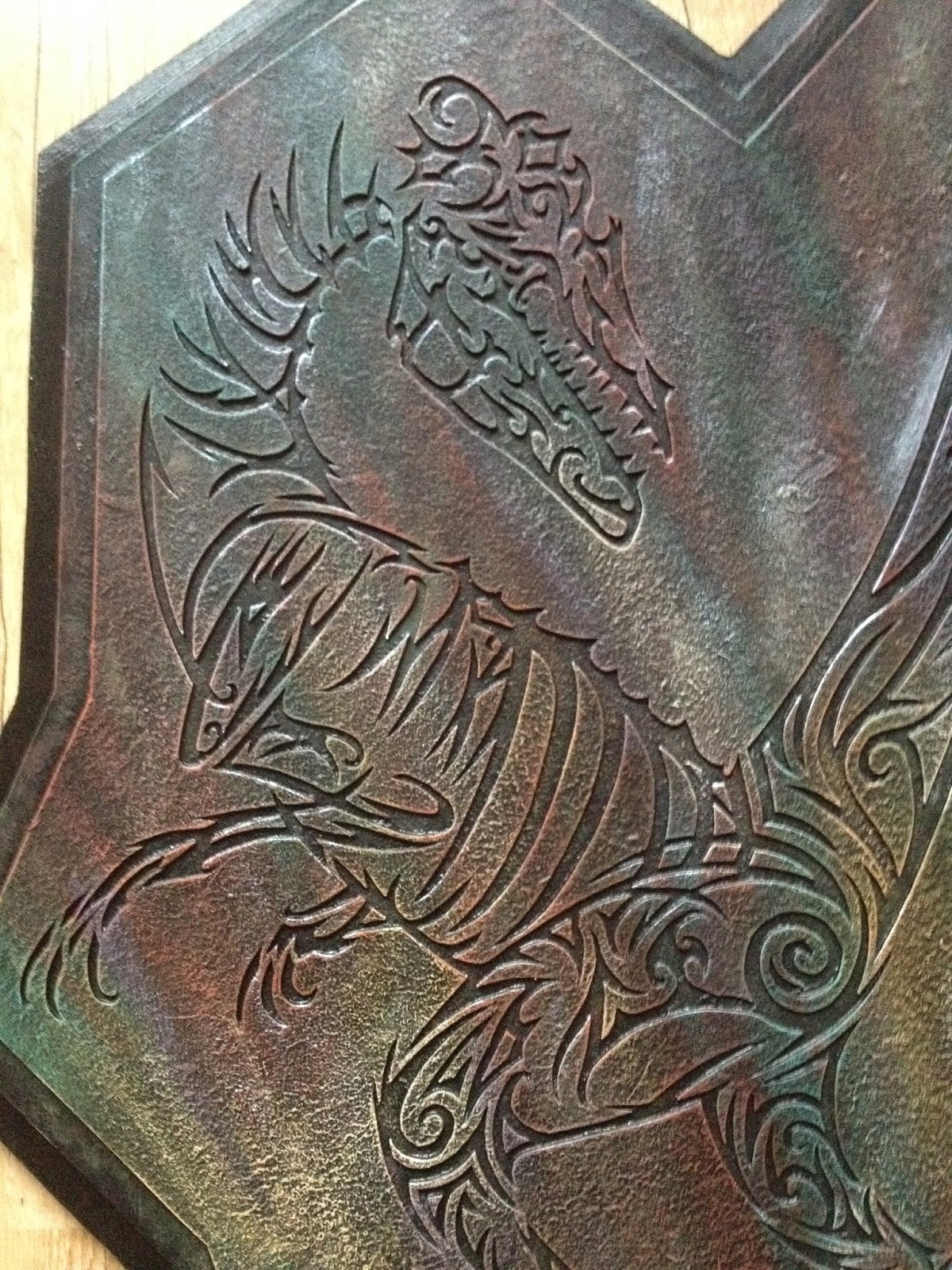
I had a good range of designs to work with by this stage and thought it a good opportunity to repeat a few with new colour scheme, etc. However I worked on a number of new designs as well during this stage. My next design would be the most complicated yet piece. Up until this stage my most complex design had been the squid plaque that formed one single piece of card, for my next design based on a Velociraptor I would create a steencil that was made up of separate pieces that lined up to form one complete structure. The reason for this was I wanted to have a fossil like feel to it. Something that had been unearthed and whilst the remains had remained together, they were still disconnected and gave a more skeletal feel locked in stone.
Along with the raptor plaque I started to redo some of my older designs, the fangtooth and anglerfish stencils I drew up again and made the plaque pieces along with the maquettes at the same time. I also took this opportunity to do another small anglerfish plaque as well as a small anglerfish maquette using the plaque's stencil, like the other pieces, as a starting point.
Below are my finished plaques I made along side the maquettes, the two large plaques have a relatively siilar colour scheme. I was more interested in the types of surface details and levels of texture I could build up. Have a look at the close up images to see what I came up with after playing round with different techniques of surface texture.
Small Anglerfish.
Large Fangtooth Fish.
Large Anglerfish.
Whilst developing the velociraptor plaque in the same style as the previous pieces I used the stencil to make up a reverse version of the plaque piece and mounted it on a newly designed wooden mdf frame. As my normal plaques had used the removed sections to make up the piece, I now used the actual stencil itself to develop a new piece, in this sense the new plaque resembled a skeleton more closely as it was raised off the mounted surface.
The frame I developed for it was curved and initially just an experimental design but I actual found it worked better than my previous more rigid frames. It also seemed much easier to cut out with the jigsaw and looked smarter. Where as the previous frames were made up a straight lines difficult to cut and line up, the curved lines suited the use of a jigsaw more naturally and I felt over all this design worked better.


No comments:
Post a Comment