I made a note of it and kept the article to remind myself. After developing my first batch of fish I remembered what I had read about and wondered how I could develop pieces inspired by fossils. At this point I had been working with the off cuts of my stencils to develop a second piece of art out of one and began playing around with surface textures and the kind of details I could develop and paint to create something striking from a distance, but highly detailed under closer scrutiny.
I began working on a smaller Anglerfish piece in the same style I had done before. The image above shows the three main sections of the piece cut from a single sheet of mount board with a scalpel. The stencil, the pieces removed from the inside and the outline block.
Using the stencil as a guide I reassembled the pieces on a second sheet of mount board, shown above. My next step was to build up a textured surface on which to drybrush. The last pic above shows the stencil lined up on top of the plaque. The next stage was to build up a rough and textured surface with wood adhesive followed by acrylic paint. This made the card much stronger and helped create a surface the drybrushing effect would work well with.
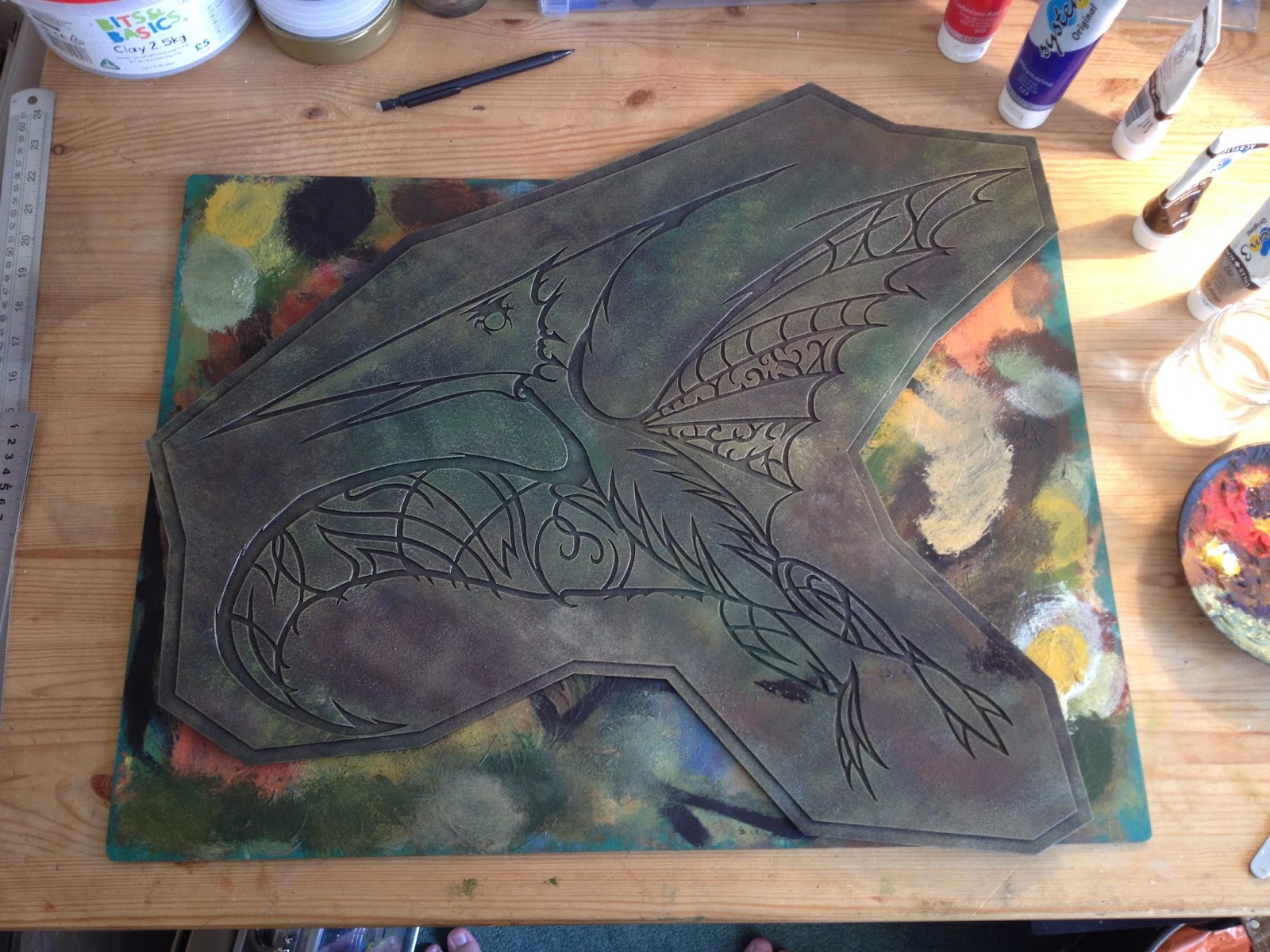
I then framed and boxed up the piece similar to the Fangtooth before it and moved on to my next design. I started with a pretty simple sketch, at this stage I was drawing lots of different and hadn't really settled on which to do next. I moved on from the fish and developed the Pteranodon piece based on the sketch below.
I drew up a design onto mount board from the initial sketch I had done. As this was a larger and more complicated design from what I'd done so far I copied the design onto tracing paper before cutting it out. This meant I could line up the pieces and keep them in the same position whilst I cut them from the card, as you can see below.
For the Pteranodon I wanted a more engineered and man-made look to the design. Something that had a feel of organic, biological structure to it but in a more stylised and constructed way. The head for example I imagined as separate pieces of sheet metal ornately finished, almost like a venetian mask.
I also decided to develop a smaller Fangtooth piece, much like I had with the Anglerfish. I took my original design and scaled it down with simplifying the detail too much.
The final piece I made in my first batch of plaques was by far the most complicated. I designed a squid which was then cut in one piece from a single sheet of mount board as you can see below.
Above you can see the stencil I cut in one piece, below is the finished plaque. For the colours I wanted the blue and green tones to merge seemlessly and give that impression of mirky yet colourful water. The flashes of gold I wanted to represent the rays of light shining through the water but also hint at the colour of the squid itself as the light reflected off its translucent flesh.
With my first batch done I had started to get an idea of how the materials worked together. The wooden frame had prevent the piece from warping and created a rigid, strong structure but had increased the overall weight a fair bit, which I would explore in my next batch.
Below is the finished first batch together.


No comments:
Post a Comment