Friday, 11 February 2011

Sweeney Todd: Part Two.

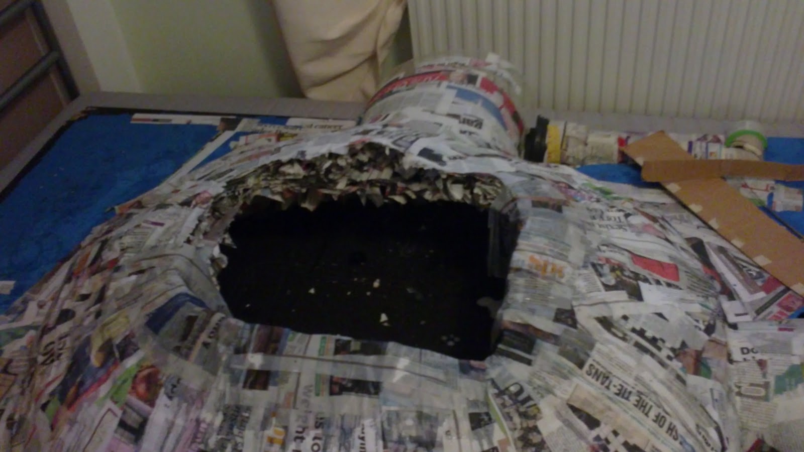
Last week I continued working on the oven as well as attending a run of the first half of the play to get a feel for the performance side of things (having focused on the technical side of the show so far). This hugely helped me keep up to date with the show, I could look at the blocking of different scenes as well as what was still needed. Back in the workshop I began cutting out the back of the oven so it can be lit from through the grill.

In order to not cut into the oven itself I began by cutting a small hole with a jigsaw, I then made it progressively bigger until I was pleased with the over all look and size of the hole. As this exposed the loose underside of the paper layers I initially taped down any that weren't secure. Next I began to use more papier mache to secure them further, as well as laying them over the wood rim. This was because I was worried lose pieces of paper exposed to a strong beam of light for too long might end up catching alight, which wouldn't be great.

As I layered the paper down I became concerned the mass of glue running down the sheets into the bowl of the oven would make the grill soggy and warp. I decided therefore to paint the grill to prevent it from becoming too wet and disfiguring the front of the oven.

After I had done this I stopped working on the main oven for the time being and concentrated on the victorian motif I had yet to build for the crest of the oven.

I had sketched the design a number of times but as the play's theme was Steampunk I altered it slightly. What I came up with was a more complex design, perhaps to hard to build in 3D but one that incorporated both the flowing curves I had originally considered with a more man-made, artificial design.

Here you can see as well as the ornate detail, the design also includes more rigid structures such as the gears and wheels. I thought this was more fitting but would be too complex to make. Not only that but I didn't have the time to dedicate to it, and from the audience's postiton they wouldn't see it very well anyway, especially if the lighting was dim. However, I still used it as my main design and would construct its outline, if not the interior detail.

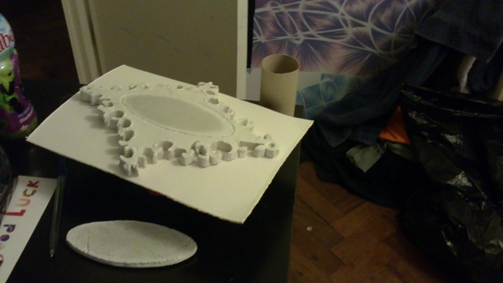
Using air drying clay (I thought this was the most practical) I rolled out a sheet, roughly an inch thick, with a empty wine bottle. While doing this I noticed the surface of the wine bottle became cloudy and dusty-looking.
I thought this would be a perfect method for creating antique, old bottles for use in the scenes or on shelves behind the counter, etc.

Once I had done this I used a photocopy of my design to trace the outline of the motif with a scalpel. This however proved very difficult so I cut out the design with a pair of scissors and followed as best I could. Although the overall piece I finished was different to what I had drawn it worked just as well.


The clay prior to carving.

The design starts to take shape...

The completed piece.
To add to the three dimensional look I constructed an oval disc for the centre of the motif, which I then carved a border into. I then allowed it time to dry on a curved piece of card on top of the wine bottle, this would allow the curve of the oven to sit perfectly between the motif and surface of the oven.


Once it had finally dried a spent a good few days appying glue to the card so that it was completely secured to the clay and would be able hold on when placed upright. Once I was convinced there was no chance of the clay falling off it was ready to be taken into uni and attached to the main oven.

When I took the clay piece in this morning I used a huge amount of LX electrial tape to secure the clay to the oven. Although this might not sound like the most practical resource I find it is ten times more reliable than masking tape, and easier to paint over than the surface of selotape.
 After attaching it I realised it would take alot of work with papier mache to get the piece looking as though it fitted against the oven smoothly. However, due to the curve I had let it dry in it sat quite happily on the oven's surface. This completed my work on the oven for the week.

The oven so far.

The Visit

Last friday I had my first design meeting for the second year physical theatre group's production of The Visit. As it is a physical theatre piece the set is pretty minimum, however, the director decided he would like a number of signs made that would mark different scenes on stage. These signs would be hung from the rig, placed over the front of tables, or even held by a member of the cast. As the play is set in the delapidated town of Guellen the signs are intended to represent different areas or buildings of the town. For example, the largest and grandest of the signs is the Golden Apostle Hotel, which will be hung form the rig as it much more important than the others but also it would be too large to be held by actors.

During the meeting we talked about the different aspects of the play and the layout of the set so that I was brought up to speed with the show. I discussed with the director what he wanted from each sign and went away that weekend to draw up designs for the meeting on monday.


As the show is on at the beginning of march it was crucial that designs were developed and approved of as soon as possible. Over the weekend I devised a wide variety of designs for the director to decide on. By doing this it sped up the process of getting the designs picked so that no time would be lost actually drawing up and painting them on time. Above are my designs for the railway station, general store, wood carving and police station. They all follow a style fitting to the 1950s, post-war setting of the play. Below is my designs for the hotel sign, I also included another option for the geeneral store to add to the variety.


Having presented my ideas to the director on monday the designs have all been chosen and sizes decided on. Although the size we agreed on are slightly smaller than they would be in reality, due to the lack of time, we felt it would be better to have smaller, more accurately and detailed signs than larger, more rushed versions.


Today I spent the best part of the morning clearing a space in the workshop to start building the signs. Once I had done that I drew the outlines of their dimensions to get a better idea of the their scale. This also gave me a sense of how long it would take to complete them all. Tomorrow I will be starting to draw up the lettering so I can concentrate on painting next week.

Wednesday, 2 February 2011

Sweeney Todd: The Demon Barber of Fleet Street.

By the end of October our Drama Society, a group formed by students to produce shows independent from our degree, had began holding nights in which students could pitch shows they wanted to direct. These were to be performed just before Christmas or in the new year. One of the shows chosen to be produced was Sweeney Todd, although it isn't to be performed until the beginning of April. The reason it was pitched so early on was to get casting out the way, put the vast number of costumes together, and build the set, to name but a few. Not only this but as the shows produced by the society are not part of our degree any work we take on board is in addition to our studies. As the set designer I realised before taking on the role that alot of preparation would have to be done way in advance. Not only so I wouldn't be swamped by the combined work load of university studies and society demands, but also so I could develop the set to a standard that I was pleased with. Furthermore, it would take a good deal of planning to make sure the set construction didn't eat up the budget of four hundred pounds for the whole show, as it easily could given the very nature of the play. I began to do rough sketches of the different elements of the set I had discovered on reading the script.

Above is an early concept for the set. As the show is to be performed in studio 3 I obviously took this into consideration when developing my idea, as shown by the curtain rail that frames the set. Here you can see the design is focused on the barber shop, the pie shop and the oven. The three boards mounted on wheels in the foreground are to be used for 'sub scenes' that are based around locations that pop up only once ortwice. They therefore don't require as elaborate sets and would be too costly any how. The barber shop is raised on steel decking four foot high which not only gives the idea of an upstairs shop but also allows the oven in front to form a different location without taking up more space. I realised the main sections of the set that would require time to build by myself were the sign for Lovett's pie shop, the screens that move around displaying different scenes (a book shelf, street wall, market stand, etc), and the oven. 


During one of our production meetings an idea was pitched to the tech team that would transform the show. The costume team had been discussing Todd with a lecturer who had suggested we change the style of the play from straight victorian to steampunk. Although open to the idea I didn't have a very good understanding of what exactly steampunk was so I went away and researched it. After googling steampunk and looking at a number of artists work I began to understand how steampunk stems from victorian styles of fashion, architecture and culture, but in a more futuristic, fantasy style. With this information I began to re-work my design for the set, still keeping the same 'shell' but changing the overall look. For instance, making the oven more elaborate, and changing the walls of the barber shop from delapidated wall paper to sheets of iron.


Above you can see how the steampunk theme altered my designs whilst still keeping the orginal layout of the set. I also decided to include a twiriling barber's pole sign. After this was approved I began considering how I would go about building the set. The steel decking would be easy to get hold of, as well as the counter for Lovett's shop. Sourcing  The three main features of the set I will be building are the 'Lovett's' sign, the barber's pole sign and the oven.

The first and most elaborate design element of the set is the oven and I have spent the last month constructing it. Back at the end of Decenber I got hold of a piece of hard board from the theatre workshop at uni and drew out the basic design for it just before I went home for Christmas.

I decided the most logical way of building the oven would be to create a three dimensional facade on the surface of the wood. I started building it up with cardboard tubes, plant pots, even coke cans...


I initially began securing the tubes with masking tape. 


I decided to reinforce the structure I had so far built using papier mache, as it was cheap and effective. By using wood adhesive instead of PVA it also hugely increased the strength and durability of the piece overall. Using a Pimms pitcher (appropriate i know) i mixed together the glue with about five parts water and (having tore newspaper into long strips) dipped the newspaper into the glue and laid it across the surface. As the materials I had used were not sturdy enough for practical wear and tear it was crucial I improved the strength of the oven.

Having built the outer structures I started to think about how I would build the main belly of the oven. Using a medicine ball covered in tin foil as a mould, I again soaked strips of paper in glue and laid them over the surface. After doing this a number of times and allowing it to set I then cut strips out of the mushroom shaped structure, leaving them attached nearer the centre. This allowed me to stretch the shape to the edges of the oven i had drawn out. I then laid two rings of garden wire over the centre to act as a frame, and keep the shape of the oven.
 Left you can see how I built up the structure with paper.

One difficulty I had to deal with during the layering of the dome was that as the oven is completely made of paper, so adding to much glue to the surface weighed down and loosened its structure. I was constantly having to prop up sides before they collpased but this was a minor proce to pay for constructing the oven cost free. I used the techniques of scrunching up balls of paper to pad out the steeper sides although I eventually changed this to strips of scrunched up paper as they made the job quicker. As a result the thickness of the oven was greately improved as well as its surface look.

Here you can see the main belly of the oven prior to me evening out it's surface.
Once I was happy with the surface of the oven I added a few more layers to the top as well as coating it with PVA for additional strength. After finishing the building of the oven's shape I moved onto the surface detail. First i painted all of the flat spaces inbetween with blue paint just so I had a clearer idea of the shape. Then I began work on the grill.

I experimented with a number of different designs for the grill and the surface details, e.g. hinges, locks, etc. I wanted it to look intimidating and bold but almost have a natural, organic look to their design too. The designs I chose have a sharp, gothic look to them, with sharp repeptitive angles. They also imcorporate smother, more flowing shapes that are more celtic in their origin. This use of a variety of different styles drawn them different cultures was important as it created a new theme that was more suited to the steampunk look we were after.

The oven begins to take shape.
Once the designs had been decided on and I had built the grill, I began to cut out the front of the oven. One thing i realised was how thick it really was, this was reassuring as I was less worried about damaging it. Using aa bread knife I cut out the rectangular shape of the openning.


 I then dressed the walls of the hatch with more paper to secure it and neaten it up. While this was drying I started to think how I was going to make the lion's feet that would hold up the oven.


Orginally I had considered carving them out of wood or polerstyrene but as this wasn't available to me I thought about using paper (yet again). Cutting up newspaper into small squares I mixed them with alot of glue and some water to create a pulp. I then used this to mould the feet onto the wooden sheet where they would be.


                                           While the feet began to dry I went back to the grill and, gluing the back of it, I taped it down so it would bend to the shape of the oven. Below you can see the grill and foot attached, the oven was really beginning to look more impressive by this stage. My next step was to work on the surface detail of the grill, it's hinges, frame and latch.

 
To make the grill stronger I used the sections I had to cut out the improve the thickness of it's bars. I also built a boarder for it and began drawing out the hinges and latch, as you can see below.


With the hinges and latch attached the oven was complete in terms of its structure. I still had the victorian motif around the base of the chimney to carve but as I had achieved everything I could do in my room I decided to take it in to the theatre workshop at uni. There I could paint it and finish any work remaining on it.


Once in uni I began undercoating the oven in white and neatened up the wood at the back in black as it will be for the show. I still havent decided on the colour scheme for the oven yet and so have left it painted white.

 As is obvious from the photo above the feet have been removed. Having taken much longer than I expected to dry I left them in my room next to the radiator.

With the hole still to cut into the back, colour schemes still to decide upon, the motif to mould from clay, and little touch ups here and there to do this completed the main section of the build for the oven. So far I am pleased with its progress, I have managed to save a bundle on the budget by building it cost free out of newspaper, and, more importantly, finally got my bed back!

Saturday, 29 January 2011

Love & Money

Our first semster of third year theatre arts consisted of us being divided into two groups of around fifteen or so students and forming two production companies for a show to be performed at the end of November. The production company itself consisted of a tech crew, director and actors. As part of the tech crew I decided to focus on the set and lighting side of the production. The play we decided on was Dennis Kelly's Love and Money. The reason we chose this play was that we believed the issues of materialism, capitalism and society, for example, were extremely relevant. Especially considering the economic climate of the time and the recent recession Britain had undergone. Not only this but practically and logistically the play was appropriate; it contained the right number of characters that were even enough for the cast to agree with and the running time of the play was around what we were aiming for, based on the fact we had under eight weeks to pull it off!

Having read the script my first job was to decide on the set, after a meeting with the director we thought the best approach would be to have a very simple, almost clinical set. The reason behind this was that play was very much driven by the characters it presented, not the location they were placed in. For me the play read like a science experiment, putting a variety of people in modern day society under the microscope and analysing them. Thus it was decided the set would be simple, but in many ways striking, perhaps even intimidating. It mainly composed of two white cubes (chairs) and a white cuboid (table) placed in a rectangular space in the centre of the stage. This rectangular area was to be made of two strips of dance mat that, placed together, formed the acting area, the black space that surrounded this 'stage' was empty, a no-man's land where no performance took place or light was to be focused on.

This would focus all of the audience's attention on the actors and therefore costume was crucial in helping create the characters the cast would portray. We considered what would surround this black floor space and after initially considering three black drapes we decided three white cycloramas would emphasise the idea of the white box and the sterile, cold atmosphere of our play.


I therefore went away and made up a model box for the production company and lecturers to help explain our idea. After the idea was approved by everyone we began work on constructing our three shapes as time was ticking by and, although simple in their look, i realised it would take alot of time and concentration to give them the smooth, solid, seamless look to their surfaces that i felt was very important. This would be difficult to achieve, as they were comprised of five pieces externally.


Above shows the rough design of the boxes and the underside of one under construction. The drawings on the right give an insight into how we formed the cubes and the wooden skeleton that gave the thin sheets of wood the strength of durability demanded of them. The cross of wood underneath the box was designed not only for additional strength to the structure, but also to conceal the four wheels that would eventually be attached underneath. It was important to me that these wheels, though practical and essential during scene changes, remained unseen by the audience. This, as well as aesthetically pleasing, gave me the opportunity to adjust the wheels if the box became too wobbly, say by moving them further out from the centre and more towards their corners. 

Once the boxes were constructed i began work on giving them a smooth, solid look. At first i sanded them down using sandpaper and, in the case of the table, a surf form. Once i had exhausted myself doing that i decided to use a thick layer of builder's cork to literally plaster the sides smoother. As it was cheap and effective we spent a few pounds of the budget on a couple of tubes, this being the only thing we had needed cash for as the wood for the boxes was recycled from previous sets. This, combined with a generous layer of white emulsion, created the desired effect and we could move on from the boxes.

Further down the rehearsal line we realised that during the hospital scene we would need a bed and screen. In order to keep with the sterile, crisp look of the set we used a metal frame with material attached for the screen, and a metal, wire framed bed. To improve their appearance we sprayed them both with metallic silver spray paint, making them look as good as new, as opposed to the tatty state we had found them in.

Another development in the set design was the use of the white cycs that would frame the black stage area. The realisation that this would be a major task to light meant that we ditched the two side cycs and kept the one at the back as a focus point. Furthermore, we realised we simply didnt have enough lighting resources avaliable to us to light all three, and to have rented some would have massively eatten in to the budget (which really wasn't an option).


Above is my favourite picture that i took of the set, simply because you could easily mistake it for the model box! But rest assured it is the real thing. Here you can see the side cycs have been replaced with black masking curtains. This turned out to be incredably useful as it completely openned up the wings for the cast and allowed us to side light them with booms, much like a dance piece. This marked an important turning point in the relationship of the set and lighting as it allowed us to light the cyc separately, as i will be explaning later.

With the set nearing completion we began to design the lighting plan. To begin with we rigged the lights we would be using for the general cover, as these are used simply to light the space and not relied on to do anything too fancy. Below you can see the general cover prior to focusing. Once finsihed they would light the grey dance mats/acting area only and, in keeping with the set, would not light the black space, being focused sharply as best we could.

The arrangment of the lights in the rig were designed with the idea that it would incorporate two lighting designs, one that focused on the acting area and one that would be used to light the white cyclorama behind. As we were now only using one cyc I begain to become more adventurous with the lighting plan. We decided the cyc would focus on creating the location of the scene taking place on stage, be it a dining room, dingy pub, mental hospital or a park bench at sunset, etc. As the set was placed half way up the stage, there was a huge void of space behind the cyc perfect to set up a lighting rig at ground level as shown below.


Using scaffold and steel decking we created a rig directly behind the cyc. I then spent the best part of a day simply playing around with the lights and experimenting with different coloured gels and lights to create the scenes for the play. The scaff you can se in the foreground was stacked in a row to create a horizon, by lighting it the from further back it created a sunset across the sheet. I researched a number of different skylines at dusk to try and create a autumn sunset. Using reds, yellows and oranges, as well as pinks and blues to create a watercolour like stain across the cyc. Which to be honest was a lot of fun!


What i began to realise while devising the lighting scheme was that the decisions made during the set design hugely influenced the role of lighting, in a positive way. Although at first dewildering to try and imagine how we would go about lighting the space, it became evident that there was a huge amount of potential to the show in what we could create.


This photo shows the sunset I had created, although this photo didnt turn out brilliantly because of the white glare that has obscured the cyc you can see how we began to go about creating scenes, here the trees in the park have cast a shadow across the bench while the sun sets in the distance. While much would be altered and many more lights used, this shows the early stages of our work. I really liked the way our gobos (such as trees, windows, etc) cast their shapes across the white surfaces of the boxes, such as the jail bars, which gave a striking image.

As the lighting progressed we became determined to make every scene look radically different then the previous one through the lighting, whilst still making it appropriate for the scene and remain within context.

For the preset we wanted something that intrigued the audience as they entered and took their seats. This photo, taken from the lighting box, shows what we decided on. The stage is dimly lit, while the cyc is soaked in blue. Each of the cubes has a profile pointing directly down on it from the rig with a square outline gobo inside that outlines each of them as they seem to float on the stage. It almost looks like a surreal game show set. I thought it important to highlight the boxes right form the beginning because they become very important as they are sat on by the various characters that emerge on stage, exposing them to the audience and lifting them up. After all, it is the characters we are here to observe and learn about.

Overall I was pleased with what we accomplished with the set and lighting designs. I think if given an extra week we could of tightened it up alot in terms of lighting. Perhaps experimenting a bit more and going over each scene to make sure the cast were perfectly lit and, in terms of the side booms, they didnt mask each other when enetering on stage. In the end the stage was completely surrounded by lights and i think one of our biggest achievements was that we didnt get carried away and use lights for the sake of it. Everything we included played a role and hopefully the audience were pleased with the end result. I suppose in the end I could have spent forever re-tweaking it but I am satisfied with what I achieved and the invaluable experience I gained from the production.

The Big Catch Up...

Well it's been some time since my last entry and in the posts that follow I will be discussing the shows I have been involved in over the past four months. I'll be starting wayyy back at the end of September/beginning of November and documenting what i've been up to. Having finally bought myself a laptop (Hurray!) I can at last upload the photos from productions i've worked on, so people have a clear idea of what the heck i'm talking about. This will also massively help me to update my blog more consistently in the future!