Below is my first finished fish. I tried to give it a look of being constructed out of old scrap pieces of metal that had been left lying around a junk yard and become rusted and exposed to the elements.

After completing my first prototype I decided to experiment with different designs and colours. I chose two designs based on fish that had striking shapes to them, rather than fish that would not work as well recreated in this style and look too simplistic.
After creating another fish in the same style as the first I decided to alter my next design to something that had a more dynamic shape to it than a straight fish, below is the swordfish I developed in a curve. I wanted to create the idea of an animal in motion, rather than simply recreating the shape of a creature.
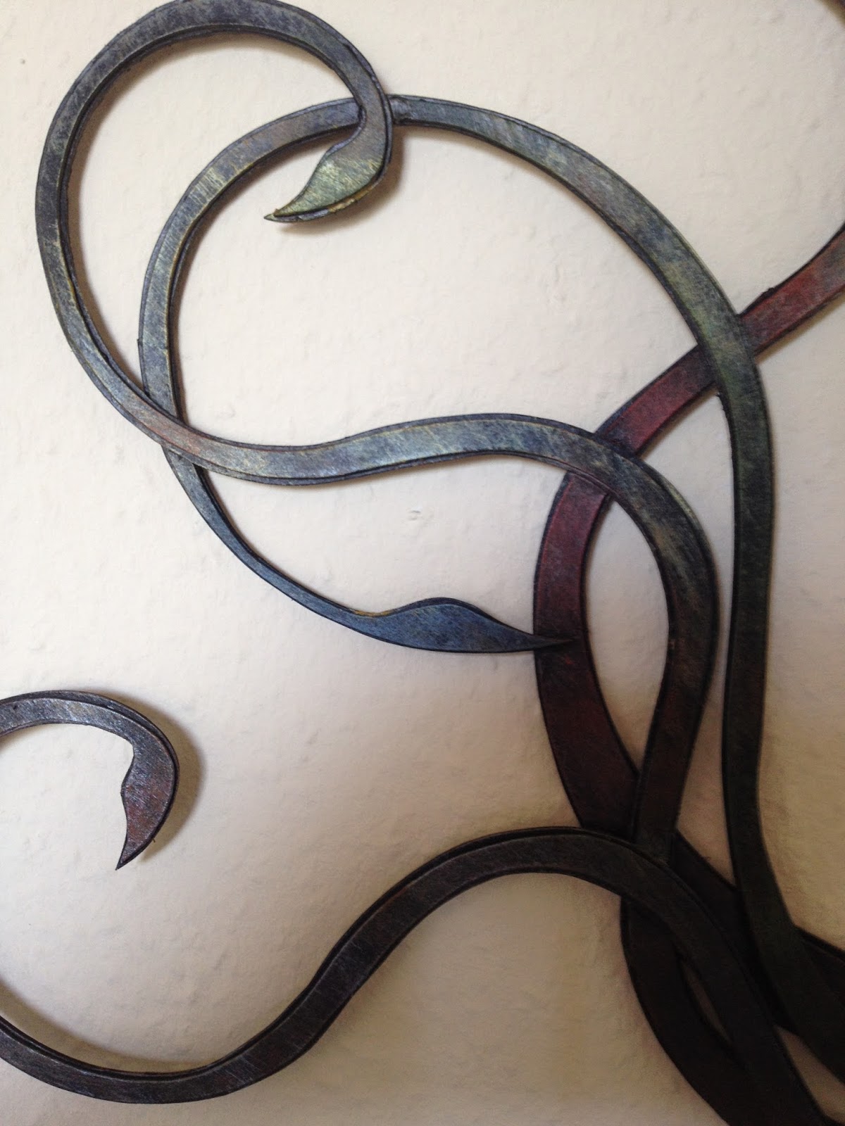
With my first three fish finished I then moved on to making a squid in similar style, working in card but then painting the surface to create the effect of rusted metal. This design differed from the previous as it was flat on one side and designed to be hung on a wall. I experimented more with the colour scheme this time as I wanted to build up a more textured surface detail and play around with the types of effects I could create. I put a wide range of colours into this piece but tried to overlap and layer them in a really subtle way rather than block out areas in different tones.
After I finished my first batch of fish I decided to move on to new designs. While the three dimensional fish worked well and formed a good starting point I wanted to develop more designs that were flat on one side and could be hung against a wall. This would allow me to put more detail into the one side of the fish that would be seen and experiment with more painting techniques that I will show in my next post!


No comments:
Post a Comment