
I drew up a rough design based on what I learnt from his books and my own knowledge of paper mache. Materials wise I would only need newspaper, an old bed sheet, garden wires and metal coat hangers, as well as polymer clay and marbles for the teeth and eye details. I decided to mount in on a piece of MDF I would jigsaw a shield shape out of.I then used a router on the edge to give a more detailed finish to the wood.
I based my design on a number of different styles from European and Asian dragons as well as what I had seen on Dan Reeder's videos and in his book. My first step was to cut out and assemble the shield as this would form the base from which I would build up the shape of the dragon to ensure a strong bond.


For the shield I added a raised section in the middle to act as the foundation for me to work off and build up the shape of the dragon's neck.Below you can see where I began to use balls of newspaper taped together to build up the shape of the neck. Once I had a rough shape to this I began coating it in layers of paper mache. I also made up a egg-like shape to form the skull separately and began coating it in layers of paper mache mix after which I left to dry for a good long while.


Above you can see the neck section of the dragon made of paper mache. Once it had thoroughly dried I pulled out all the loose, dry layers of newspaper from the inside to give a firm, hollow shell. I then attached this to the base plate of the shield with garden wires running all the way around and covered in tape. Below is the rough skull shape I made separately in the same method. Once dried I cut into two halves resembling the jaws of the dragon and removed all the dry loose clumps of newspaper from the inside leaving to hollow halves.


My next stage was to make the teeth for the inside of the jaws. Using polymer clay I rolled out some thin needle-like teeth. Once baked I began to fix them to the outside of the lower and upper jaw sections.


With the neck and jaws roughly assembled the next step was to begin assembling the main structure of the dragon. Using wire and hot glue I attached the lower jaw to the neck mounted on the shield. At this stage the overall look of the dragon was still pretty basic. My plan as to get the whole thing assembled before building up the final details on the surface. This made it a lot easier for me to focus on making sure the bonds between all the separate components were secure and firmly in place.

Having used paper mache to form the basic shapes I now began to build up the surface with the cloth mache technique in Dan Reeder's book. Soaking strips of an old bed sheet in PVA and water I layered up the surfaces and tried to create details were the skin of the dragon would be loose or tightly held. For example underneath the jaw and at the top of the neck I sculpted a series of wrinkle in the cloth were the scaley skin was sagging and molting like a komodo dragon. This secondary layer further strengthened the whole structure whilst giving a more realistic finish to the dragon.


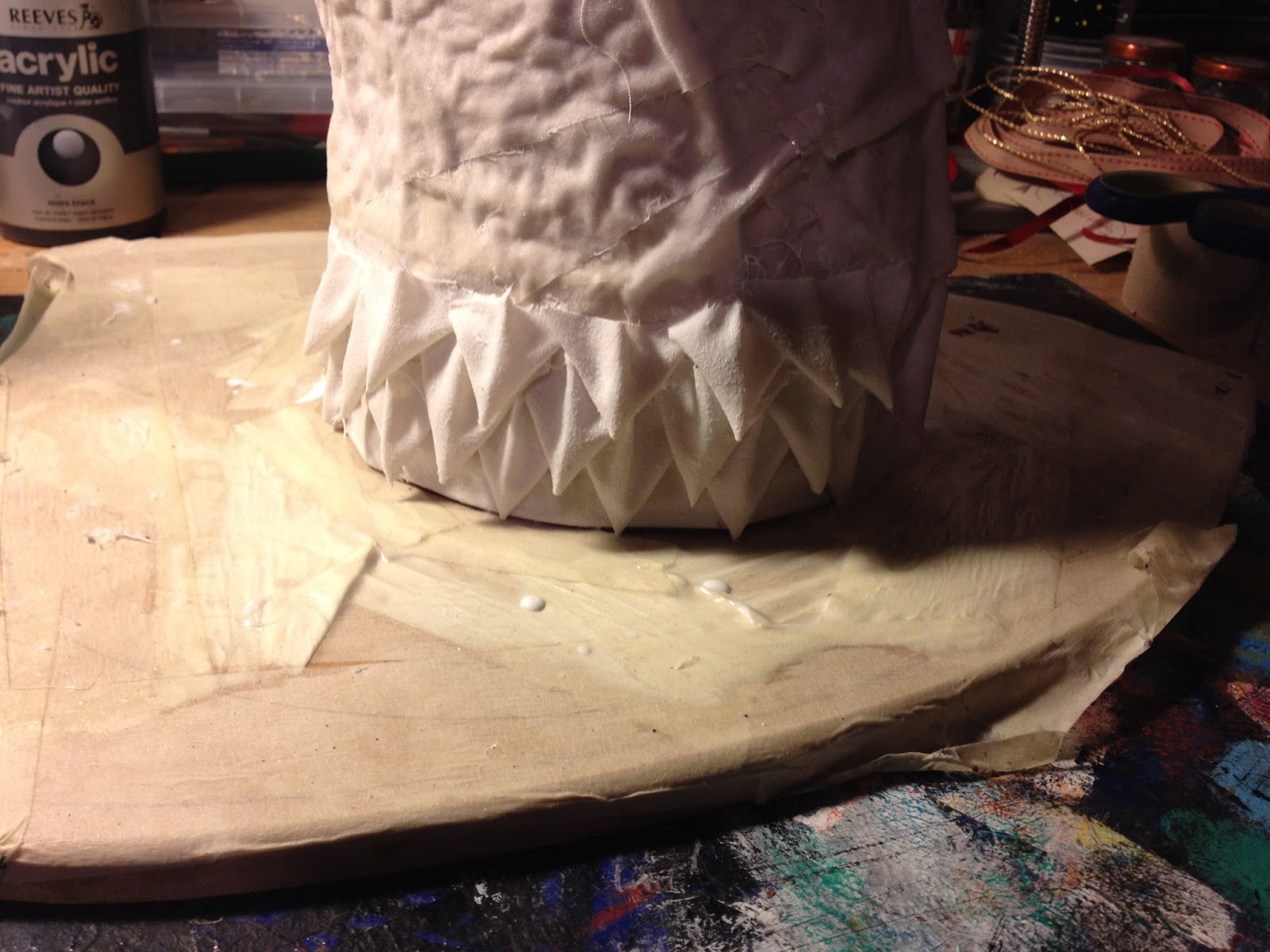
Above you can see where I had began adding detail to the front of the neck by building up layers of plates where the scales would lead down to the chest. I lined the inside of the mouth pieces with cloth mache to create the look of the inside of the mouth. Below I tried lining up the two pieces to see how they would look once attached.

I began attaching long weed-like whiskers to the bottom jaw to add to the aquatic look of the dragon, after that I painted both the insides black and began building up layers of triangular scales that would cover the majority of the neck of the dragon.

After I attached the upper jaw to the rest of the body the dragon finally began to take on its final look. At this stage with all the major components attached I could begin to build up the finer details to the surface and flesh out the facial features as well as horns and scales. As the scales on the neck were quite time consuming I tried to do a batch every so often in between sections of detail on the rest of the body.


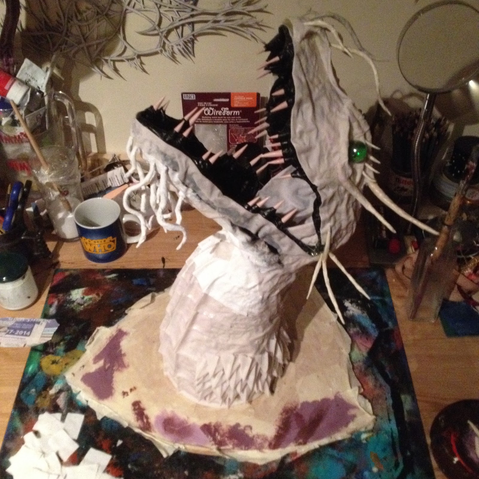


I ended up using marbles for the eyes as I couldn't get taxidermy eyes large enough, however I grew to prefer them. I think they gave a more mythical and other worldly look to the dragon rather than typical eyes. They also reflect light quite well and stood out rather than getting lost in all the facial detail.


My next step was to add the flaps of materials in between the spines on the back and corners of the mouth. Soaking layers of material in PVA and water I draped them across the rows of spines on one side, allowed to dry and then repeated the process on the other side of the spines, sandwiching the spines between the material. Once both sides were dry I used scissors and a scalpel to carve the material into crests along the back and on both sides of the mouth.


A few final embellishments I added was a couple of scales dotted around the face to avoid it looking too different from the neck section as well as strips of netted material to give the idea of scales but more in keeping with fish and marine life than reptile ones.


With construction of the dragon complete I began looking into colour schemes for the surface and what would work best on certain sections of the animal. As I was trying to convey the idea of a sea dragon I looked at a lot of turquoise tones and differing shades of blue and green.
I wanted to keep the palette quite small and avoid a broad range of colours, rather building of layers and hues rather than patches of separate colour. However, for the crest I chose a purple which still had a lot of blue in it. This would dramatically highlight sections of the dragon without looking odd. I also looked at a number of acrylics that had a shimmer or enamel like finish to then. Further presenting the idea of an animal use to an aquatic environment and give a realistic finish to the surface of the scales. These paints I would use on the top layer as the finally coat sparsely used to hint and pick up the light in certain sections.


Having undercoated the whole thing in white I began by using washes of colour to block out the sections of the dragon were colours would deepen or become brighter. I broke it up into a number of sections, mainly the gullet, scales, face, whiskers, horns and crest.


With the dragon painted I finished off the shield, removing the masking tape that had protected it and give it a block of paint before rubbing it down with sand paper to give a more aged, authentic look to the surface. Below is the finished Sea Dragon mounted on the wall. As my first attempt at a paper and cloth mache piece it was a massive learning curve during the process of designing and constructing however I was really pleased with my first attempt and learnt a lot that would come in handy when I moved on to my next one.


