Within the brief it mentioned how the Riddler was an expert in engineering and puzzle-making so I also began to research machinery, particularly power stations but also the works of M.C. Escher and Giovanni Piranesi. Their work has a strong theme of architectural design that is both elaborate and disorientating that I felt would suit the Riddler's lair perfectly. The set I wanted to create was one that portrayed the Riddler's character heavily. He is an eccentric genius who has taken the dilapidated underground of Gotham City and let his imagination run riot 'redecorating' the old sewage systems and tunnel ways. I wanted people to be able to look at the set and get a strong idea of his character before they actually see him on screen.
Escher's work gave the sense of distortion and clever confusion I felt would fit the Riddler's mind, however I was particularly drawn to Piranesi's Prison etchings as well. The repeated use of catwalks and arches in his work was a huge source of inspiration, and pointed me in the right direction of where I wanted to go with my design. While a older form of architecture than I had in mind, the shapes and railings broke up the space and gave the sort of depth and drama I would be interested in repeating in my own design.
My next stage of research would be to take the style of Piranesi's work but apply it to the relevant type of architecture I would want to incorporate. Giving it a more mechanical and industrial feel I looked at power plants and subway entrances.

The images above represent each of the areas I looked at in depth, from complex and elaborate engineering to derelict but structurally emotive tunnels and desolate spaces I was keen to show in the set how the Riddler and his 'gang' had come into these empty, abandoned spaces and completely reworked them. The final image above is from an exhibition by Anish Kapoor, I had been a fan of his work for a while and played with the idea of his distortive artwork being part of the set. By this stage I had a good idea of the style and mood I wanted to create in my set. I had worked on shows previously that had been set in subterranean areas in London and it was important for me to recreate that feeling of unease but also fascination in walking into a space that had been shut off and forgotten for years while the city above moved on. As if you are almost intruding, feeling a sense of unease at how quiet it is.
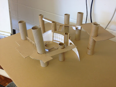
In my first rough model I focused on the main section of the Riddler's lair, trying to create a central area that was surrounded by stairways and catwalks. In order to connect all these cat walks I thought of having lots of huge rusty pipes, forming columns and giving a maze-like feel to the whole area. Ultimately, this initial model proved unsuccessful, it felt as though it was more of a game show design, as if relying on a cyclorama to conceal the back walls of the studio. It also failed to give the sense of depth I had hoped to achieve and so the majority of this design were scraped. I liked the idea of multiple screens and a large question mark in the center but realised I would need to incorporate them more realistically into the surrounding architecture that would have been in place before the Riddler 'set up shop' in the area.
I decided that rather than having one, large expansive space that would be broken up by columns, arches, etc I would instead break up the set into smaller sections which then connected to each other and formed the subterranean complex. These individual sets all had a different feel to them, but as you traveled deeper the presence of the Riddler would become stronger and more apparent.
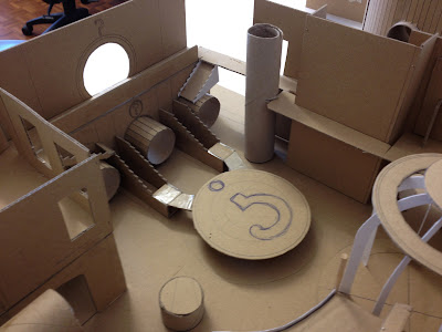
For the main section of the Riddler's lair I realised I could create a much more dynamic set by having the pipes lay flat rather than having them all raising up around the space. As well as being more asethtically pleasing, the pipes gave the sense of continuation and extended the main set beyond its boundaries. As well as providing more dramatic lighting opportunities it made the immediate space feel as though it was just one area that could be entered and exited from various points and would lead off to other mysterious spaces. As opposed to one self-contained area that more obviously showed the boundaries of the set, now my design felt as though it was part of a more expansive, labyrinth of passage ways.

As the separate parts of the set came together I started to consider how they would all connect up. I thought about it from the point of view of Batman discovering the location of the Riddler's lair and making his way deeper into it and what he encounters along the way. In this sense the set fell back on the 'game show' element I had originally fallen into but this time round it worked in the sets favor. In the older TV series Batman and Robin always had to make their way through a series of rooms almost like contestants on a game show, so in this sense I retained the style of the older series, albeit in a more updated, grittier setting.
 |
| Early rough sketch of the layout of the drum. |
After descending into the first chamber that established the derelict, sewer setting I wanted a more dynamic and ambitious set piece. Utilising the tank within Pinewood studio D I developed a tall atrium structure that would use more water than the other set pieces. As the height of the studio restricted overly tall builds the tank provided me with the extra height needed and also a practical, space to use water within. I designed the set around the idea of Batman/Robin being captured and suspended above a large tank with acid pouring into it from protruding pipes around the drum, whilst they are slowly lowered into the bubbling tank. As the use of water would present a more challenging build I wanted to keep the space as small and closed off as possible. Reducing the logistical problems produced by using a large quantity of water on set but not having a knock on effect towards the drama of the scene.
The brief stated that the entrance was via a subway tunnel, instead of simply having an old, rusted door as the entrance I researched subways and was inspired by a photo of a busker stood in front of a series of large advertisements on the wall behind. I thought it would be a nice touch if the busker performing in front of the posters was one of the Riddler's henchmen, keeping guard while the poster behind would slide away to reveal the entrance to the Riddler's lair. After a short tunnel I wanted to have a staircase leading down into the first chamber, for this reason I had to raise up the subway section onto rostra.
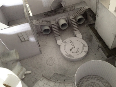
I continued to flesh out the main section of the Riddler's lair, an important element I considered while building up the rough model was to ensure the space didn't feel closed off. As I mentioned earlier, while an important section of the set, I wanted to give the idea there was much more of it that remained unseen. The entrance to other tunnels, chambers and doorways had to create this effect. I also considered what the space had been used for prior to the Riddler taking up residence in the abandoned tunnels. As I had lots of pipes protruding from walls and high-up catwalks running along the walls I decided the chamber had originally been part of the sewage network, where many different tunnels met and flowed into one larger chamber. At some point it had been decommissioned and drained but the water mark was still visible on the walls all around. Once the Riddler had discovered it he had it properly dried out, as it was a large subterranean space it would be perfect as his main lair, with plenty of space for him and his goons to work and live in.
As the rough model neared completion I started researching the different surface details and textures I wanted to create around the set. My main focus was to look at metals and brickwork that had been neglected for a long period of time, creating vivid colours that would be appropriate for the setting but also relate to the eccentric nature of the Riddler. As the original TV series had used bright, punchy colours I wanted to, instead of simply recreating that style, incorporate it more subtly into the surrounding surfaces. A lot of the distressed textures I looked at had taken on an almost psychedelic colour scheme simply by being left to the elements and this seemed to work perfectly for the mood I wanted to create. While the Riddler has brought in a lot of materials with him to set up his lair he has also made use of what is around him, being a genius he has utilised the scraps that have been abandoned in the tunnels.
 |
| Completed model, showing the raised platform on which sits the first section of the set and entrance to the lair complex. |
 |
| Above shot of the scale model in its entirety, separated into three more manageable sections. |
The two images above show my completed model. Built in Pinewood studio D, the base for the set represents the size of the studio that would house all the set pieces. Due to the size of the model I separated it into three sections that fit snugly together to show the studio as a whole but can be taken apart to get in closer and focus specifically on each area of the model. I decided not to have every area connected together for ease of moving around the set and it proved unnecessary as each area had entrances and exits off screen.

For my first section I wanted to create a dramatic change from the initial subway entrance as you descended into the old tunnel ways, the first chamber I designed to been filled with a shallow amount of water flowing through it. I also used column-like pipes to break up the space and create depth in an otherwise square room. I wanted to immediately give the impression the Riddler had left his mark on this area so instead of having the catwalk running from two previously existing entrances one was connected to a exit knocked out of the brick work, giving the set more of a back story. I also began experimenting with camera angles and using the depth created of the pipes to set up shots.
Once I completed the build side of the model I decided to give it a more run-down look, in order to make it look less pristine and more grungy and derelict. Giving the model a light coating of hair spray helped achieve a closer style to the surface texture I would create in the set itself. In the case of the main lair section above I gave the model a heavier coating on the lower sections of the walls and the corners in order to represent the water mark left stained over the years.
With the model complete I moved on to experimenting with lighting, initially trying to create a dramatic effect with lighting at different angles. In the photos above and below I used varying colour fairy lights positioned in different areas to see how effectively the lighting could work within the set and what sort of moods could be created with simple lighting.
Ultimately the more natural positioning the lighting the more effective and successful the shots appeared. Whilst I tried more complex and stark lighting techniques, the more dramatic shots I achieved were ones which used a few simple but well placed beams of light. Using a subtle haze and a strong beam in entrances creating a much more impressive sense of depth and lively setting.
Throughout the development process I had constantly evolved and amended my design. Initially I had struggled to pin my idea down and present a concept that flowed throughout the entirety of the model. However, as I have found with all project I undertook whilst on the MA, the back-bone of any strong design I have achieved has been a concise and thorough gathering of research. In this project I looked at a much broader scope of research areas than in my previous work so the challenge that arose in this instance was marrying them happily together. By consciously thinking about how each section would work in a practical manner really helped to keep my ideas grounded. It also helped to think up the back story of a setting, how it has evolved over time and why certain set pieces were placed in a specific location aided me in not over complicating a set. Constantly referring to the brief and being mindful of each decision I made gave me a much greater sense of ownership and confidence whilst working under pressure to produce a finished design concept by the ambitious deadline.
My next blog will focus on my major and final project during the MA, an adaption of Jules Verne's 20 000 Leagues Under The Sea. As well as the exhibition that was held at the end of this project and ended my year studying Production Design for Film ad TV.


